
The Role of Interior Layout in Improving Staff Efficiency in Medical Clinics
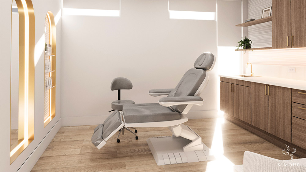
Walk into a medical clinic and you can usually tell, within a few seconds, whether the space has been thought through or simply patched together over time. Some places feel calm and easy to move through. Others feel like everyone is forever side-stepping a trolley, hunting for files, or trying not to bump into each other near the reception desk. That difference is rarely an accident. It often comes down to interior layout.
For medical clinics across Australia, a well-planned layout does more than look neat. It helps staff work faster, reduces daily frustration, and makes the whole place feel less strained. When rooms, corridors, storage, and work zones are arranged properly, the staff spend less time walking back and forth and more time doing the job that actually matters.
Why Layout Matters More Than Most People Think
In a clinic, time slips away in tiny fragments. A nurse walks to fetch supplies. A receptionist answers a phone while checking in a patient. A doctor waits for a room to be cleared. None of it sounds dramatic on its own, but stacked across a full day, it eats into efficiency.
A sharp interior layout trims those wasted steps. It places the right things in the right spots, so staff can move naturally from one task to the next. That might mean keeping treatment rooms close to supply areas, placing printer access near admin desks, or making sure waiting areas do not block circulation paths. Small changes, yes, but they add up quickly.
In many Australian clinics, space is limited and rental costs are no joke. That makes smart layout decisions even more valuable. Every square metre needs to earn its keep, whether the clinic is in inner-city Sydney, suburban Brisbane, or a growing regional practice in Victoria.
Reception Sets the Tone
Reception is not just a desk and a chair. It is the clinic’s traffic controller. Patients arrive unsure, sometimes anxious, often in a hurry. Staff at reception need to greet them, manage bookings, handle calls, and keep things flowing without looking flustered. That is hard enough on a good day. A clumsy layout makes it far worse.
A well-placed reception area gives staff clear sightlines to the entrance and waiting room. It also keeps key tools within reach, which cuts down on unnecessary movement. If the printer is behind a storage cupboard and the appointment book is three metres away, the whole process slows down. Nobody wants a receptionist doing laps like they are training for a 5k.
Good acoustic planning helps too. If the reception desk sits too close to the waiting area, privacy can become a problem. Staff end up repeating patient details, voices carry, and the whole front-of-house experience feels messy. A thoughtful layout keeps communication smooth while respecting confidentiality.
Workflow Should Feel Natural, Not Forced
One of the clearest signs of an effective clinic layout is how easily staff move through the day. The best spaces follow the rhythm of the work. They allow patient intake, consultation, treatment, cleaning, and restocking to happen with as little cross-traffic as possible.
Think about a typical appointment. A patient checks in, waits, is guided into a room, receives treatment, and leaves. After that, the room needs cleaning and resetting for the next person. If the layout is awkward, every stage becomes a mini obstacle course. Staff may have to double back through shared spaces, dodge patients in narrow corridors, or search for clean linen in a cramped cupboard.
A stronger layout smooths those steps out. Treatment rooms near sterilisation points make sense. Shared equipment stored centrally saves time. Short, clear routes between rooms cut down on unnecessary walking. The result feels calmer, even if everyone is moving fast.
Simple Zoning Makes a Big Difference
Clinic interiors work best when different activities have their own zones. Public areas, clinical areas, and admin spaces each need distinct functions. When those zones blur together, staff lose focus and the whole place starts to feel cluttered.
For example, staff lunch areas should sit away from patient flow. Admin desks need privacy and fewer interruptions. Clinical zones should be close to storage and cleaning access, with equipment arranged so staff can grab what they need without faffing around. Nothing fancy, just sensible planning.
In regional Australian clinics, where teams are often smaller, zoning becomes even more useful. Staff may wear several hats during the day, so the layout has to support quick task switching without chaos. That is where good planning quietly earns its keep.
Storage Can Make or Break Efficiency
Ask anyone in a clinic what slows them down, and storage will come up fast. Not enough of it, badly placed storage, or storage that is packed to the ceiling with items no one has seen since 2021. It all creates friction.
Well-designed storage sits close to the point of use. Gloves, paperwork, consumables, and cleaning supplies should be easy to reach without staff trekking across the building. Drawers, cupboards, and shelving need to be logical, not an archaeological dig.
There is also a neat side benefit here. When storage is well integrated into the layout, the clinic looks tidier. That has a practical effect too. Staff can find things faster when they are not surrounded by clutter. Less rummaging, less grumbling, fewer “has anyone seen the tape?” moments.
Space Around the Staff Matters Too
Efficiency is not only about speed. It is also about whether staff can work without feeling boxed in. Tight spaces cause tension. People hesitate when passing each other. Trolleys get stuck. A simple task turns into a shuffle.
More generous circulation space helps staff move confidently and safely. It also improves accessibility for patients, which is a big deal in Australian healthcare settings. Wheelchairs, prams, walkers, and mobility aids all need room to move without creating a bottleneck.
Staff rooms deserve attention here as well. A small breather area that feels separate from clinical work can make a proper difference during a long shift. It gives the team somewhere to reset, which is no small thing when the pace is relentless. A clinic runs better when its people are not running on fumes.
Layout and Technology Need to Work Together
Medical clinics rely heavily on technology now. Computers, booking systems, diagnostic equipment, telehealth setups, and printers all need a place in the design. If the layout ignores them, staff end up stretching cables, crowding benches, or hunting for power points like they have stumbled into a scavenger hunt.
Smart layout planning keeps tech where it belongs. Screens should be easy to view without blocking movement. Power access needs to be practical. Shared devices should sit in spots that make sense for the way staff actually work, not where they happen to fit.
It is here that clinics often lean on experts who understand the balance between function and presentation, including dental fitouts professionals who know how to shape healthcare spaces around real workflows. That kind of thinking matters because a good layout is never just about filling rooms. It is about making the rooms useful.
Regional Clinics Face Different Layout Pressures
Across Australia, clinic needs vary quite a bit. A practice in Melbourne might be squeezed into a compact urban footprint. A clinic in rural Queensland might have more space, but fewer staff and broader service needs. Coastal centres, mining towns, and suburban hubs all bring different pressures.
That means there is no one-size-fits-all formula. A layout that works beautifully in a metropolitan setting may feel clumsy in a regional one. Some clinics need more flexible multi-use rooms. Others need stronger storage planning because deliveries come less often. In smaller communities, staff often juggle a wider range of duties, so the layout has to support quick transitions between tasks.
What stays the same is the goal. The clinic should help staff move with ease, stay organised, and keep patient flow steady. If the layout fights the team at every turn, everyone feels it.
Small Design Choices Add Up
Sometimes the improvements are almost boring in the best possible way. A doorway shifted a little. A cupboard repositioned. A corridor widened. A workstation moved away from a traffic pinch point. None of those sound glamorous, but they can transform the day-to-day feel of a clinic.
Even lighting plays a role. Bright, even lighting helps staff work more accurately and reduces strain. Clear signage helps people find where they need to be without interrupting the team. Easy-clean surfaces near high-use areas save time during turnover. These little touches work together to make the space smoother and less stressful.
When the layout is right, staff stop noticing the building so much. That is usually a good sign. They can get on with the job, move without fuss, and keep patients moving through the clinic with less drama. Not flashy. Just effective.
Final Thought
A medical clinic’s interior layout is more than a design detail. It shapes how staff work, how quickly they move, and how well the whole place runs. In a busy Australian healthcare setting, that can make the difference between a team that is constantly battling the room and one that feels properly supported by it.
Good layout planning cuts wasted steps, reduces clutter, improves privacy, and makes day-to-day routines feel far less choppy. And honestly, when a clinic works well behind the scenes, everyone feels it. Staff breathe easier. Patients move through more smoothly. The whole place just clicks.